Case Study: WHAT I’VE LEARNED as a ux designer (so far)
In my tenure at MarkMonitor, working on the product continues to be a huge opportunity to make an impact on the product. I want to use this page to document some of the ways that I’ve developed my expertise in UX since working here.
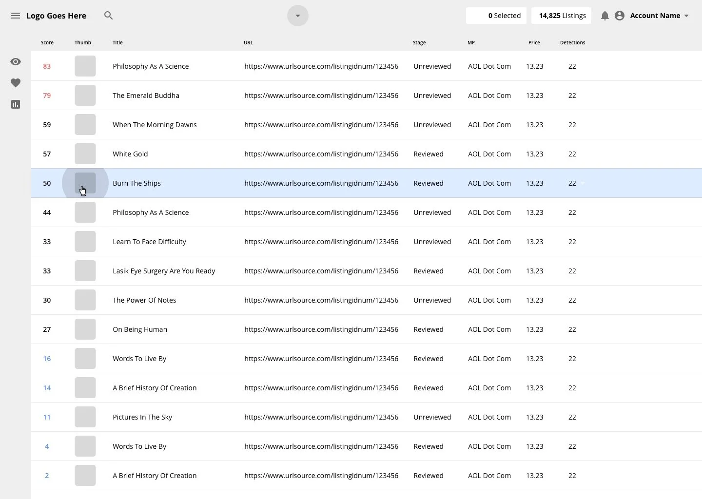
The MarkMonitor product lines, as I’ve worked on them, are very diverse in their use. For legal reasons I can’t go into detail as to their functionality. Suffice it to say that they are all complex machines with intricate requirements that need to be met when making changes (especially front-end changes). This complexity makes creating a simple, easy-to-learn product more challenging.
“Good design is as little as possible. Less, but better, because it concentrates on the essential aspects, and the products are not burdened with non-essentials. Back to purity, back to simplicity”
For this page, I’ve taken patterns we commonly use, stripped out any confidential data, and restyled it to fit a more modern aesthetic.
Currently Under Construction
My go-to UX resources
Balsamiq: Work General to specific
An important thing to remember when starting a new project is that you don’t know what you don’t know. Requirements come and go as a project progresses and it’s important not to be hung up on the nitty gritty too early. Yes, the devil’s in the details, but not before the requirements checklist is submitted. Balsamiq is a great tool to craft simple digital sketches to communicate in the early stages of projects. Yes, you’ll go to Sketch or Xd eventually, but not before you know what you’re aiming for.
Google Material: if it ain’t broke don’t fix it
Achieving a professional, modern aesthetic with your product is easy if you know what the standard is. Google invested time and talent into writing equivalent of the ten commandments of product design along with providing resources for design and dev teams to speak the same language. I’m a big fan of the material iconset and font library as well.
Sketch Measure: Being picky pays off
The closer you can get to the real-deal with your final mockups and comps, the nicer you’ll be to your developer team, and the shinier your product will be at the end of it. Sketch measure provides you with an easy, offline way to view specific details about your Sketch artboards without needing the actual Sketch product. I’d highly recommend it as a final export, redlining solution for any UX designer.
Tableau Color Palettes: No more “Crayola Bright”
I always like finding snarky opinions in design blogs, but Tableau’s breakdown of their Tableau 10 color palette was particularly interesting and useful. Picking an intentional color palette can be challenging if you don’t have a logic behind your choices. It’s interesting to see them dissect their reasoning.